I hope everyone is doing OK during these difficult times!
On behalf of the Grand Bargain transparency workstream, we have made some further improvements to the COVID-19 prototype visualisation (see original post here) and wanted to share these with the IATI community.
The number of COVID-19 activities has now significantly increased to over 5000 – the visualisation now automatically updates every hour.
We’ve recently added the following additional functionality:
- summarise by commitments or disbursements
- breakdown by reporting organisation, country or sector
- filter by sector
- download transactions in Excel, expanded out by country and sector (e.g. where a single transaction relates to multiple countries or sectors) - allowing for detailed analysis
- share / save the current view based on selected filters (the URL is now updated)
(NB most of the improvements refer to the activities tab, which uses IATI data)
I wanted to talk through some of this work and ask for feedback from the IATI community regarding whether this is a good way of reprocessing and presenting the data.
Summarising by commitments / disbursements
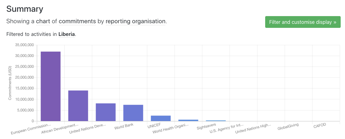
Total commitments for activities in Liberia, by reporting organisation
Initially, we just showed a list of projects, with a summary at the top showing the number of activities for each reporting organisation or country. We added new functionality to roll up by commitments or disbursements. In order to do this, we had to undertake some reprocessing of the data:
- all values are converted to USD according to the
value-date, using this dataset (with rates sourced from the OECD and Federal Reserve) - where there are multiple sectors or countries on an activity, transactions are broken down into multiple rows for each sector/country, with the transaction value proportionate to the sector/country percentages.
The resulting data is available in Excel here, in case you want to take a look.
Double-counting

Warning if results are likely to contain double-counting
We don’t currently handle double-counting in this dataset or visualisation, other than to alert the user when there is a risk of double-counting. However, there are a few ideas about how this could be handled:
- allow / encourage users to select to view only a particular type of organisation
- e.g. there is less likely to be double-counting when looking only at Governments, though there will still be some double-counting in cases of delegated cooperation
- show net disbursements instead of disbursements and net commitments instead of commitments
- i.e. disbursements MINUS incoming funds and commitments MINUS incoming commitments
- however, this will only work where organisations are reporting incoming funds; many large organisations are not doing so.
- comparing organisation IDs or (harder!) organisation names – e.g. if Germany is disbursing to UNDP, we could try to subtract that amount from UNDP’s total
- this could get a bit messy!
We would be very keen to hear if anyone has suggestions on the best way to proceed here!
Sectors
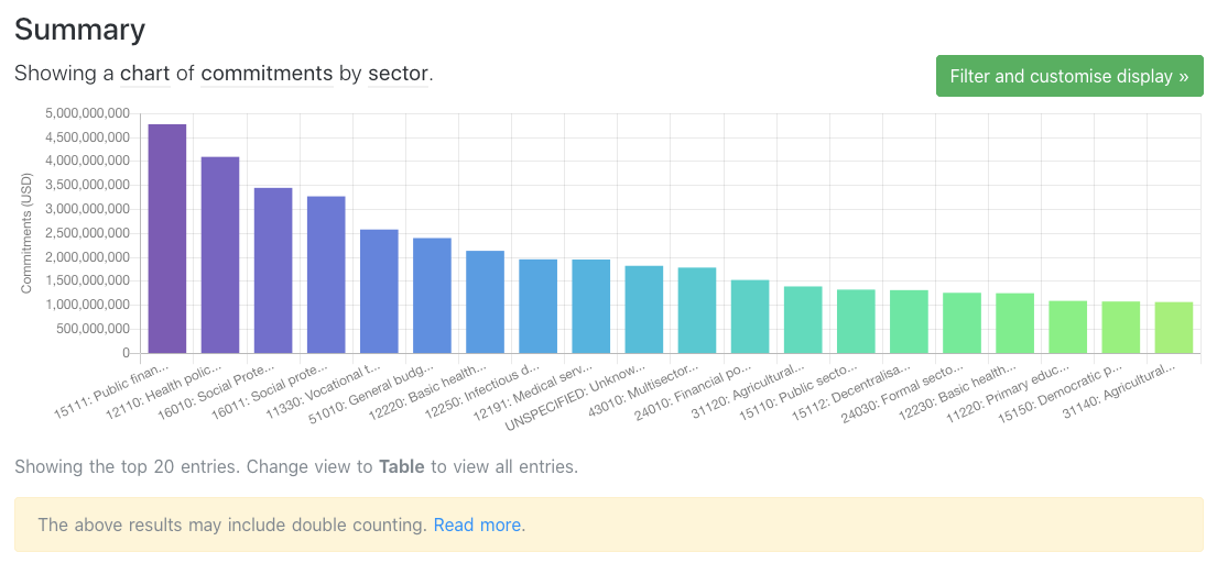
Total commitments by sector
It’s also now possible to summarise the data by sectors (we are only using the DAC codes here). Again, as shown in the image above, this summary may currently lead to double counting where more than one reporting organisation is included.
Perhaps it would be useful to be able to summarise by multiple sectors, and to select whole categories at once (e.g. all health or education sectors) – any other preferences?
Downloads
We have added a series of additional download options. On the activities tab, the blue download button now allow you to download transactions broken down by sector and country/region. For this dataset, an additional column has been added (value_USD_proportionate) which makes it easy to put a pivot table on top of the dataset. This column is calculated by multiplying the value_USD column by the proportion allocated to this sector and this country/region.
For example: a transaction for USD 100, allocated 40% health and 60% education; 50% to Kenya and 50% to Uganda would be output as:
| value_USD | sector | country_region | value_USD_proportionate |
|---|---|---|---|
| 100 | health | Kenya | 20 |
| 100 | health | Uganda | 20 |
| 100 | education | Kenya | 30 |
| 100 | education | Uganda | 30 |
In the dataset, the sector and country_region are output with the relevant sector or country codes, rather than the full sector/country names, in order to reduce the filesize.
Other plans and feedback
We are working on a few more improvements to the visualisation at the moment, for example to include the ability to filter by grant or loan. We’d be very keen to hear from anyone who might have further suggestions on how we could best present this data.
You are very welcome to add feedback here, or alternatively email us at: humportal@devinit.org