D-portal search - feedback on features

Opening this thread to see if anyone has feedback or suggestions on the search function in d-portal, and particularly if you have thoughts on any/all of the following…

(for clarity - the freetext box is the area in red here!)
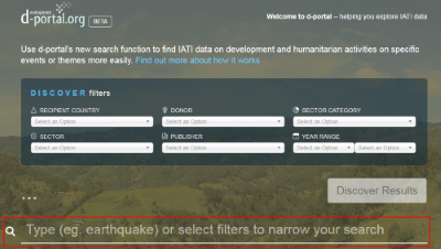
  • When typing in the freetext box, is it useful having the white dropdown options which give suggestions based on what you type?

  • When pressing enter on a freetext search - would it be useful to see more info like ‘Found xxx publishers, xxx active projects, xxx sectors’ (and to then filter for ‘Active projects’ for example?)

  • (when pressing enter on a freetext search) Do you prefer to stay on the same page and see the number of search results so you can then filter further, or just go straight to results page?

  • Would it be useful to be able to pick more than one option from each of the dropdown filters (eg multiple recipient countries, sectors etc)?

Please do reply with any thoughts/comments/suggestions on the search function, either on the specific questions above or just generally!

Thanks
Matt

Hi @Matt - thanks for sharing this

I’m interested in the drop downs - particularly the sectors.

With this in mind, can you explain the differences between the sector category sector code drop downs, in terms of what is being searched?

For example, when I select these I get:

  • Just category Ag & Food Security (311): 32,167 results
  • Just sector Agricultural Development (31120): 6,469 results
  • Both 311 & 31120: 6,447 results

I’m thinking that evidence of a sector code (eg 31120) means that a sector category (eg 311) is then inferred. d-portal is not checking/counting for instances of the explicit use of the 311 code? With this in mind, the slight discrepancy of the above numbers is worth checking - I wonder what the other 22 activities have!

Additionally, it would also be good to know the difference between the Donor and Publisher drop-downs

Lastly, in terms of layout of the drop downs, then it could be an idea to vertically align the two sector lists, particularly is they work in tandem

Thanks!

  1. Yes the drop down is useful and I think makes it a lot easier for people that are less computer literate. I would say definitely keep it.

  2. If you mean where it says found x activities, having that broken down further, that could be nice, but I wouldn’t want to add more options to type or click through. When you click discover results you get that breakdown already, and I worry by adding in that extra step in the search it could add confusion for people. Instead it would be nice to not have to click discover results once you select the searched item from the drop down menu. Instead if you could just go to the page with the results. When internet is slow those extra steps can add a lot of time, and I can’t think of a reason that why after you entered your search criteria you would just want to be told how many projects and not be taken to the page that tells you how many projects and lets you find out more about them (maybe there are people that just want that information though). This would mean however that you would need a total projects box on the results page instead of just active and completed (I know we can add those together, but for the sake of being easy and user friendly having that box would be ideal).

  3. See answer in 2, prefer to go straight away to results page.

  4. If this is referring to the actual drop down tabs, not the search function, then 100% yes. That would be huge to be to say look at multiple donors or sectors at the same time. For example if I wanted to see how much the large donors were spending on health in a country right now I would have to sort through that health countries spending generally, to see what the Bank, EU, US, UK, Japan, Germany, are spending on health in country x.

  5. Other, I generally find the new search feature really helpful and a really great addition to d-portal. I also think summary information on the results page is for the more part well done, but when I want more specific project information, I find it really overwhelming to dig through the information, especially when items are part of a bigger parent project. I wonder if it would be possible to maybe have a tab that allows one to select to only shows the parent project results with the sub projects and their details under that parent project (that may be a coding and logistical nightmare so maybe not possible). That way I could search say health in Liberia and just get the parent results, with the sub project (child) under them. That way all the supporting documentation for the parent project, which tends to be more substantial would all be in the same place, the list would seem less daunting, and it would be easier to make more connections between the work. I would be happy to talk about this or anything else is more detail off line if that is helpful.

Thanks for all your great work!

Aria Grabowski

Thanks for making d-portal a lot better!

I think it would be good to do some user testing for the layout:

  • at first I wanted to click on the three dots to enter a search term: maybe the search box should look a bit more like an entry field
  • the dropdown with suggestions is really great
  • look for ways to make it clearer that after pressing enter, the dropdown selections in the filters are altered, I didn’t notice that at first
  • I think the order of elements is confusing right now: I’d make the text box more top-central, put the filters under that text box, and maybe even list some results underneath (replacing the country and publisher lists)
  • maybe show the tiles with number of projects on the home page? then update once filters are added?
  • make the filters with a value stand out a little more so it’s clear they’re active (and maybe add a “reset all filters” button?)
  • label the button “explore these activities” instead of “discover results”?

I hope this is useful :slight_smile: always lots of ideas :wink:

Hi @stevieflow @ariag @rolfkleef

Thanks a lot for taking the time to feed into this, really great to hear your views and suggestions - lots of interesting stuff! We’ll keep this open for January and see what other feedback comes in and then make some updates next month based on your comments combined with any others that come in (and some of these suggestions are on the list or have been fed in through different channels, like Aria’s on viewing the parent/child and Rolf’s on clear filters button etc).

@stevieflow on your specific queries re sectors, will reply separately here shortly!

Thanks again

Just a quick update on the search function - over the past couple of months we’ve had various feedback on the first iteration via the IATI helpdesk, on email and here (thanks @stevieflow @ariag @rolfkleef). Much of this has been collated and is now being worked on as a next round of updates - if you’d like to see what, it’s in the Priority TO DO column here on GitHub https://github.com/devinit/D-Portal/projects/1
Will post an update when they are in place, and hope these tweaks prove useful
Matt

Hi @stevieflow - quick update on your query of numbers mismatching (by 22, across sectors 31120 and 311+31120). Eventually tracked it down to some spaces before sector codes in one publisher’s data, across 22 activities - they’ve updated it now so the numbers match on these searches now in d-portal
Thanks, Matt

Thanks @Matt

That’s interesting to hear. Did they just fix those specific codes? I wonder if it is a wider issue too, perhaps with other publishers?

This relates back to the discussion @r_clements started about identifiers I think, and where the responsibility to fix the data may lie: IATI Identifiers should not be allowed to contain special characters

@stevieflow - yes in this instance just the specific issue here has been fixed by the publisher

Thanks @Matt. It’s great that this is fixed, but may be a shame that the issue may still exist in the publisher dataset, and maybe others.

@dalepotter @hayfield any ideas how this could be identified and become actionable for publishers to resolve? A new report on the dashboard, for example (sector codes with blankspace before/after)

If I understand correctly, leading or trailing whitespace in an attribute value is causing problems with data use? In this instance it relates to sector codes - could similar problems occur elsewhere?

If my understanding is correct, the two steps I see are:

  1. Add a validation rule (in the new validator) to identify leading or trailing whitespace in attribute values.
  2. Document somewhere that any leading or trailing whitespace in attribute values should be ignored (assuming this is a valid statement to make, either for sector codes or for all attributes).

There may also be something that could be done with the Dashboard, though @dalepotter or @Wendy would be better placed to make suggestions in thie area.

Thanks @hayfield and I would agree that both the recommendations you have made are valid and we should take action accordingly especially with regard to adding the new rule to the (new) validator?

At the moment there is some validation (eg of codelist values) that is done via the Dashboard and it would be my preference to have all (both format and content) validation done in one place eg by the validator?

As an update on whitespace in attribute values, this has also led to problems with the recipient-country datastore filter.

As such, this is a problem wider than just sector codes and in tools other than d-portal.

Following various feedback from here and other places in relation to d-portal search we have today pushed live some updates - hope these are helpful for users, and as always further feedback is welcome here/in GitHub etc. These updates include

  • Allowing multiple selections on all filters

  • Including Activity Status as a dropdown

  • Ability to search for an activity ID

  • Option to order dropdowns by alphabetical order or IATI code

There’s a few FAQs on the search function here too

Thanks, Matt

1 Like